
Original Navigation
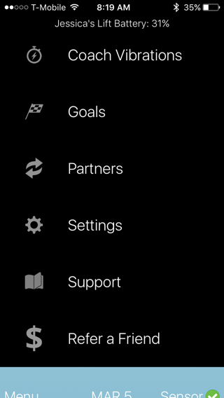
Originally, the app used a hamburger menu with all of the miscellaneous app links inside it.
Hamburger Menu Redesign
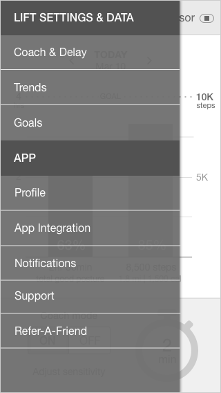
My first iteration of the redesign utilized the hamburger menu as well, but organized and with less noise.
Tab Bar Redesign
After demoing the first iteration of the app to the user testers, I received feedback that a tab bar would be clearer and easier to access. Thus, I reworked the app to use a tab bar instead in this second iteration.
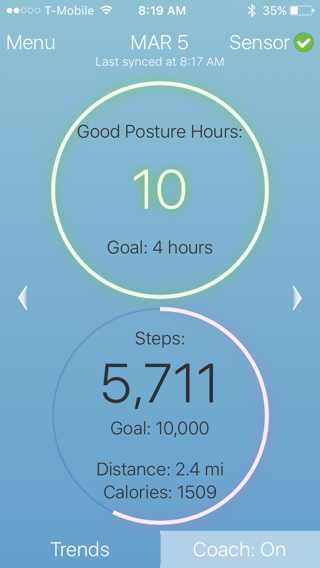
Original Home Screen
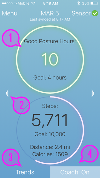
Design issues on the original home screen:
- Data is displayed in a circular graph, which is more difficult to approximate
- Arrows to see previous/next days are in the center of the page, removed from the date
- Trends link is at the bottom of the page. Users missed it and tapped on the circles instead to look at trends.
- Coach status is displayed, but the user cannot turn coach on or off on the homepage
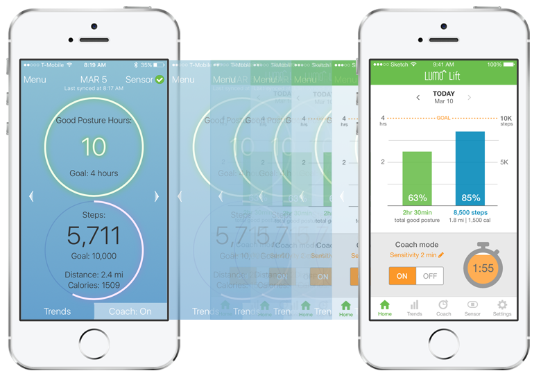
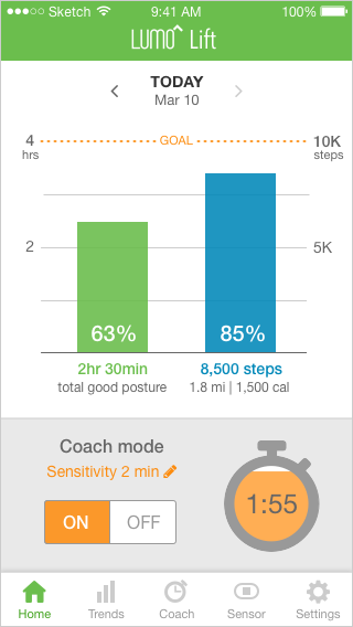
Redesigned Home Screen
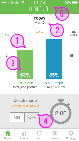
The home screen redesign addresses all of the previous issues:
- Data is displayed in a bar graph along with how the percentage completion of the user's goal
- Arrows to see previous/next days are next to the date
- Trends link is in the tab bar at the bottom. Tapping on the bar graphs also takes the user to the Trends page for a breakdown of his/her data
- Coach can be turned on and off directly on the home screen. The user also sees a live report of his/her posture in the timer to the right
- The Lumo Lift header adds branding to the app
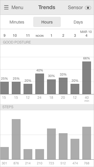
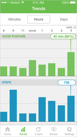
Version 1: Horizontal Bars
A horizontal bar graph layout displayed the minute breakdown (right) best, but was also constrained by how much text would fit on the sides and could not display steps and posture at once.
Version 2: Vertical, all numbers displayed
I reverted back to the vertical bars in the current app and tried displaying all of the numbers up front. However, the text was small and overwhelming. Thus, I returned to the progressive disclosure that the current app uses with the pointer that only displays one number at a time.
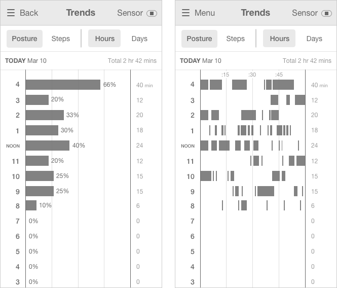
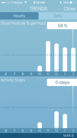
Posture by the hour
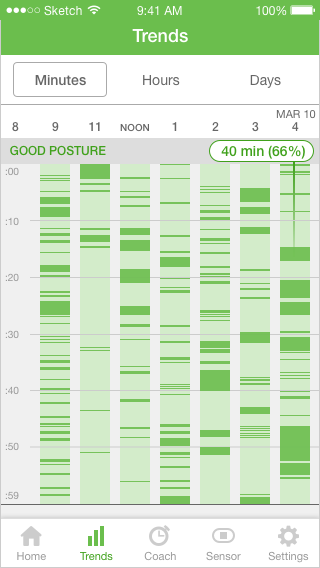
Posture by the minute
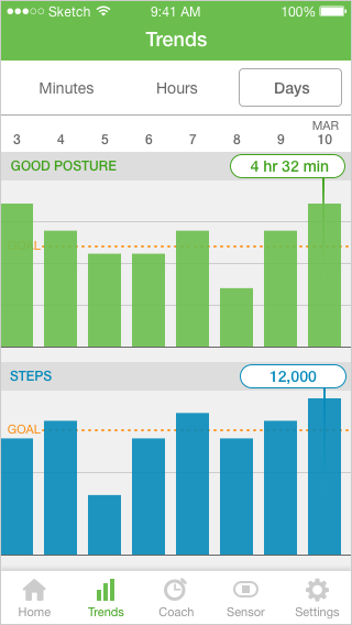
Posture by the day
Home Screen
Trends Page
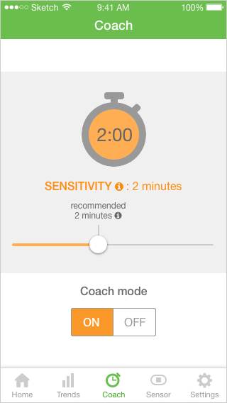
Coach Page
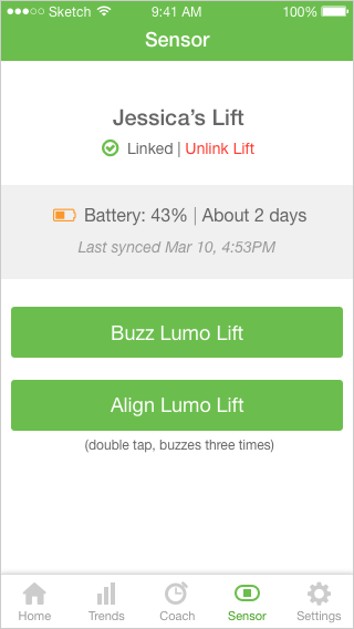
Sensor Page
Home Screen
Trends Page
Coach Page
Sensor Page