
Our final project for Information Visualization and Design was open-ended, so we were allowed to explore any data sets and visualizations that struck our fancy. After considering several different ideas, I settled on taking a closer look at processed food. Having gotten into the habit of cooking almost all of my meals using fresh ingredients, I developed a general disdain for processed and frozen foods. But how bad are they for you, really? And is the food that I cook actually any better?
All processed foods come with ingredients labels that list every chemical that you are about to consume, but I can hardly pronounce half of the contents, let alone know what they are or how they will affect my body. The whole foods (those words that I can understand, like “flour,” “cinnamon,” “carrots,” etc.) are fine – it’s all of the others that I am concerned about and know of the least.
Therefore, I set out to quantify and give shape to this ambiguous mass of unpronounceable ingredients. If, for any given processed food, I took all of the ingredients that I could understand and used them to cook the same dish with the same calorie count, then the difference in fat, sugar, sodium, etc. should be mostly due to those things like xanthum gum, maltodextrin, and soy lechitin. Right?
At least in theory. Unfortunately, food science is still inexact and food labels are woefully unspecific, so I had to piece together various data and be content with approximations. My methodology was as follows for the chosen processed foods:
- Collect the whole foods from the ingredients label
- Search allrecipes.com for a recipe that made roughly the same food with roughly the same ingredients (the best way to approximate how much of each ingredient to use)
- Adjust the chosen recipe to include only those ingredients taken from the label
- Calculate the calorie count of the adjusted recipe and scale the recipe to match the calorie count of the processed food
- Cook according to the recipe
- Calculate the nutrition facts for the homemade version of the food using calorieking.com
- Compare the nutrition facts for the processed and homemade versions of the food
Due to time and budget constraints, I chose only six foods (I had to procure all of the ingredients along with the processed food itself, cook it all, and photograph along the way. For the week that I worked on this project, all of my meals were set. But I never did touch those processed foods… and I couldn’t find anyone to pawn them off on – even on a college campus – so sadly they went straight to the trash, and were used for artistic purposes only).
As taking pictures of the food was the best form of visualization, I took my first foray into the world of photography.
Before this project, I hadn’t so much as held a DSLR for fear of dropping something so expensive, but I borrowed my housemate’s Canon DSLR in order to produce higher-quality images. Attempt to, that is…I didn’t realize until afterward that I had been in the manual setting the entire time, and there was such a thing as automatic.
I did go to great lengths for lighting, though: the only room in the house with any sort of natural lighting was that same housemate’s room on the second floor, so I shuttled ingredients and food back and forth between the kitchen and my makeshift photo studio at the foot of her bed (this is the most you can see of the set up below).
Along the way, I also realized that certain errors were made, but they were too late to correct. When something is cooked, it’s cooked! Hence the awkward percentage multipliers, because what I cooked wasn’t exactly what came in the box. And Maruchan ramen has corn and mine didn’t. I know, I know.
For each food, the presentation below shows
- The ingredients label of the processed food, with the whole food ingredients that I used highlighted in yellow. Other whole foods that I did not include are highlighted in orange.
- The original equivalent recipe that I found, with left out ingredients dimmed and adjustments marked
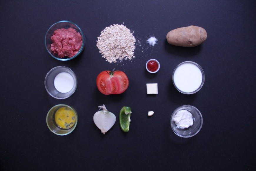
- A picture of the whole food ingredients and their portions
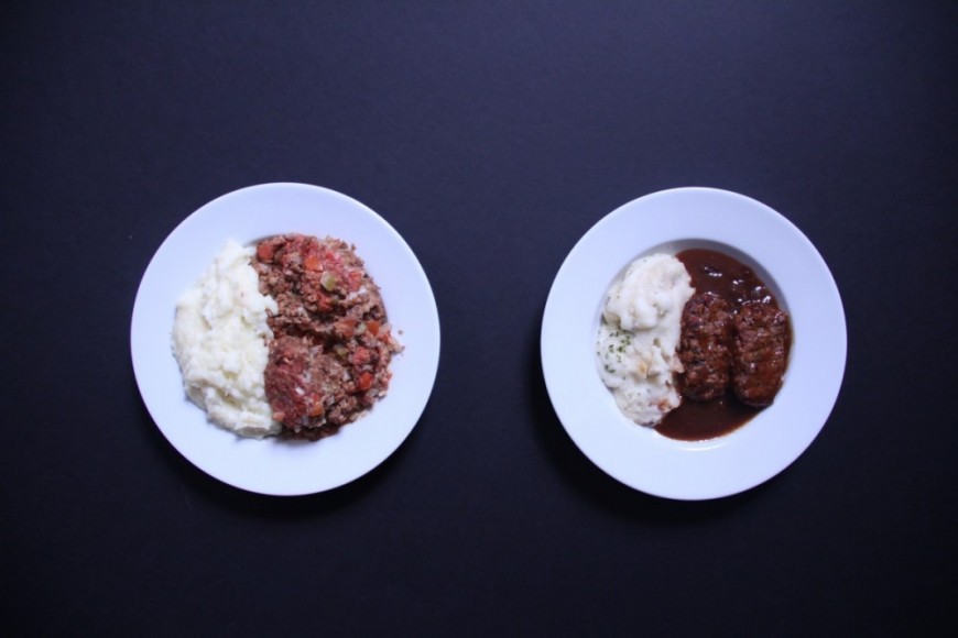
- A picture of the homemade food and the processed food, with a comparison of their nutrition facts. The option with the higher value is highlighted in blue for each category.
To my surprise, I found that the homemade foods weren’t always “healthier” than their processed counterparts. Processed food producers go to great lengths to remove the cholesterol from their products (which is arguably unhealthy because food should be consumed whole, as it was meant to, with all its components), so the homemade foods were higher in cholesterol in all six cases. The results fluctuated for some categories, but in general, my homemade versions had less sodium and more protein.
The moral of the story? Inconclusive (even with my extremely scientific approach). But I think I’ll stick with my cooking, if only because it simply looks more appetizing. For everything but the chicken pot pies cupcakes – I know, I’m working on it!