Platforms

Desktop

Roles

UX & UI Design
Prototyping
User Testing
Spec Writing

Tools

Sketch
Axure RP
Silverback


Objective

The site chrome encompassed the header and footer on desktop. It needed a visual update, reorganization, and standardization across all 6 Quidsi sites. 

Problem

The headers on the 6 Quidsi sites had not been updated for at least 3 years, making them unoptimized and outdated. In addition, there was a disconnect between the site headers on desktop and mobile. This meant that the Quidsi brands were not as strong across platforms and we weren't living up to being a "modern technology company" like we claimed.

Each of the 6 sites also had its own visually distinctive (but functionally similar) header to match its own brand. This increased the workload for both Tech and UX any time changes were made to the header. 

Solution

I redesigned a global site chrome template that met the following requirements identified by Strategy, Creative, Product, Tech, and UX:

  • Easily adaptable to the brand for each site with minimal differences (only in color and content)
  • Visually connected to the mobile and tablet headers
  • Shortened height to fit more above the fold
  • Ad zone for internal and external ads included, in an effective but unintrusive way
  • Modernized design

After drafting the new designs, I created prototypes and user tested versions of the site chrome. I used the user testing feedback to create the final design, and then wrote specs and documentation for the new site chrome.

Process

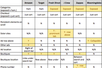
Research & Competitive Analysis

I conducted a thorough review of the site headers and footers for our top 25 eCommerce competitors to uncover navigation best practices.

Design Comps

I explored multiple versions of the site header, including an ultra-condensed view (similar to a mobile header).

User Testing

With the designs narrowed down, I led user testing to gather feedback and make sure that there were no usability problems with the redesigns.

Documentation: Guidelines

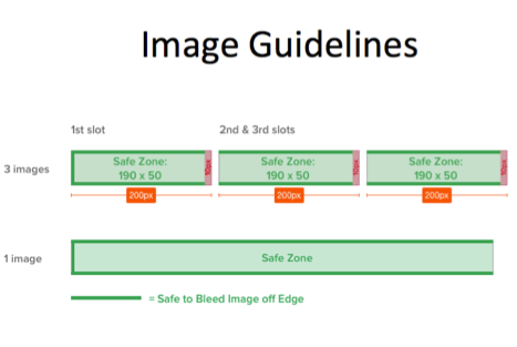
To make sure that the creative and ad teams understood how to use the new ad zones and adhered to the aesthetic of the new header, I drafted instructions and guidelines.

Key Design Elements

Links to other sites

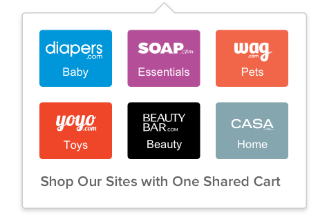
In the existing header, the links to the other 5 sites took up an entire row. Now, with a decreased emphasis on driving users to the other sites, the links didn't have to be as prominent. However, they still had to be easy to find, and the connection to the other sites still had to be clear.

Categories

Increasingly, many large eCommerce companies are placing category links under hamburger menus instead of displaying them in a row in the header. In the quest to simplify, this is an alternative that I explored.

Internal & External Ad Zones

The Advertising and Strategy teams required internal and external ad zones in the header so that they could be seen on all pages. I aimed to minimizing the intrusiveness of these zones while maximizing their effectiveness.

Design Comps

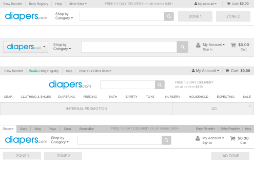
Below is a sampling of the design comps that I produced for the site chrome. I played with condensing vs. displaying categories and the links to other sites, and I experimented with varying the prominence of each element.

Comp A: Variation on the current theme

Comp B: Centered and clean

Comp C: Utility row on top

Comp D: Ultra condensed

Ultimately, the team decided on a variation that included elements of Comp A and Comp B.

User Testing

With the designs ready, I led user testing for this project, taking charge of recruiting participants, drafting the test plan, moderating some of the sessions, and compiling a report. 

User testing details:
  • Features tested: Site Chrome
  • 11 moderated sessions
  • 3 test versions: (a) Diapers full header (6 testers); (b) Diapers condensed header (3 testers); (c) Wag full header (2 testers); 
  • Setting: Quidsi user testing lab
  • Participants: 4 non-customers, along with 2 Wag customers and 5 Diapers customers who made at least 1 desktop purchase in the last 3 months and 2 purchases in the last year 
  • Halfway through the test, I moved the banner zone from the top of the header to the bottom based on initial tester feedback
Questions that I sought to answer:

No, none of the users encountered issues with the basic navigational tasks during testing. The only exception was with the "Shop Our Sites" link for the full navigation (see details below).

Actions: None.

Yes, but the roadblocks were small. 2 of the 3 testers who saw the condensed navigation had no navigational issues, but 1 tester confused the "Top Brands" carousel on the homepage with navigation. She asked, "Why not show me categories first instead of just brands?" Of the 3 testers, 1 liked the collapsed categories, 1 liked categories to be exposed, and 1 commented that "collapsed is fine if you just get used to it."

Actions: Even though there weren't big navigational issues with the condensed navigation, the Strategy team decided against it in favor of displaying all the categories up front to demonstrate the breadth of selection. Especially on diapers.com, the team feared that new customers would assume that the site only sold diapers.

4 out of the first 6 testers, who saw the the banner zone at the top of the header, did not notice it. 2 of the testers commented that they perceived the blue bar to be the top of the page and ignored the content above it. One tester said that the zone "was small, hidden, footnotey...it feels tricky." 

In the response to the feedback, we moved the ad zone to the bottom of the header in the middle of the test. 4 of the 5 remaining testers noticed the zone and had no problems with it. 1 tester commented that she typically looks at the internal ad zone "to see what the specials are" and confirmed that the zone was "an area of the site I normally would click." 

Action: I moved the ad zone from the top of the header to the bottom of the header. This design change was validated in the second half of the tests.

Version A: Full Header

Version B: Condensed Header
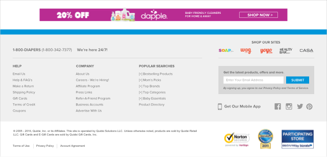
Footer

Wag Header

Before & After

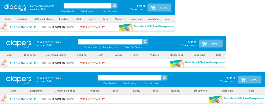
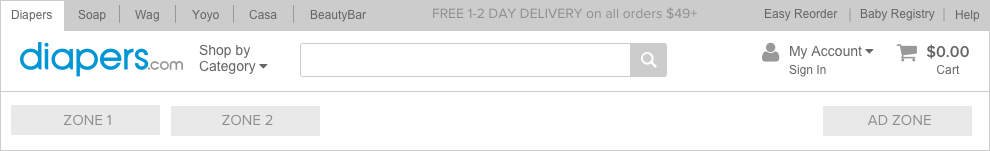
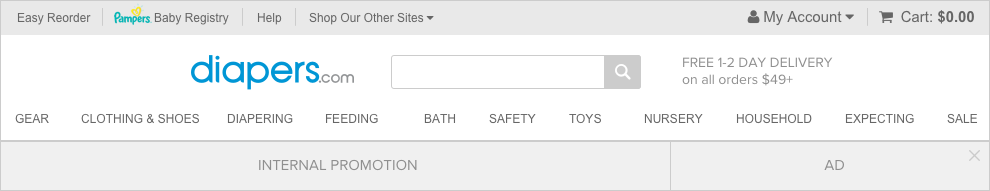
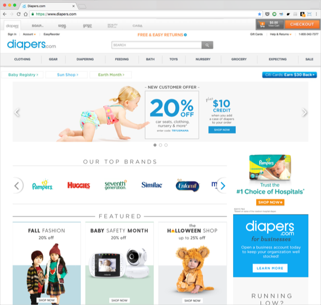
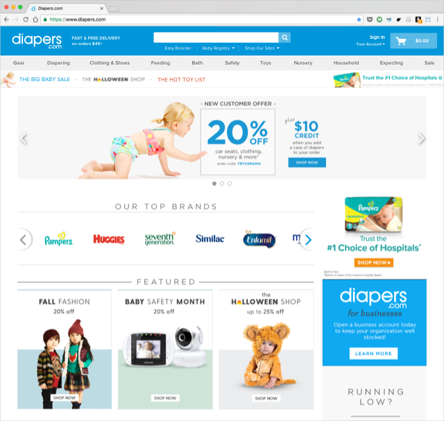
Diapers Header Before

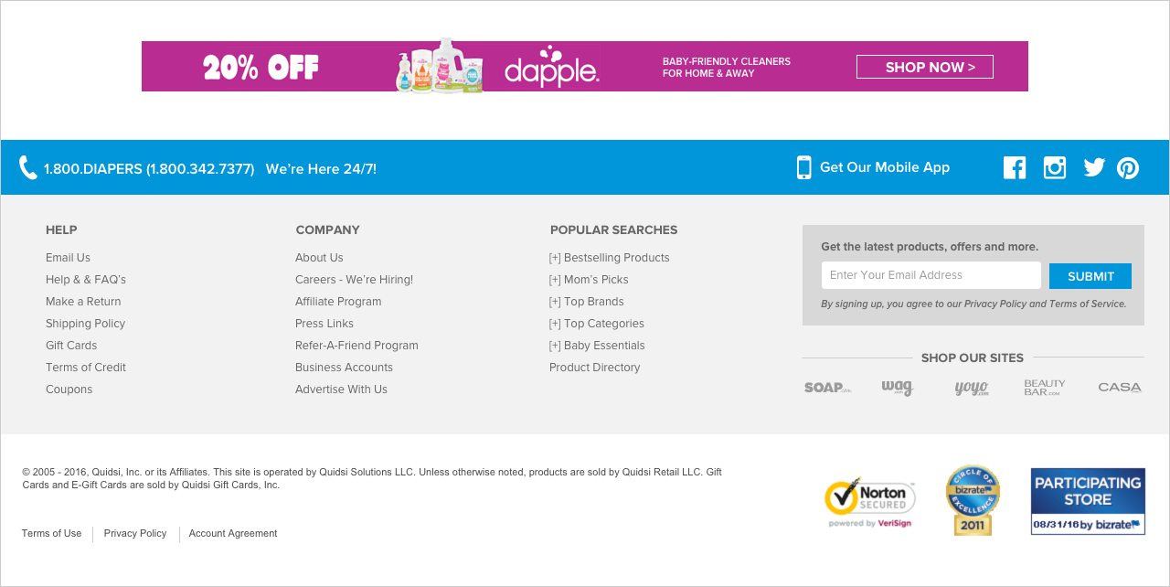
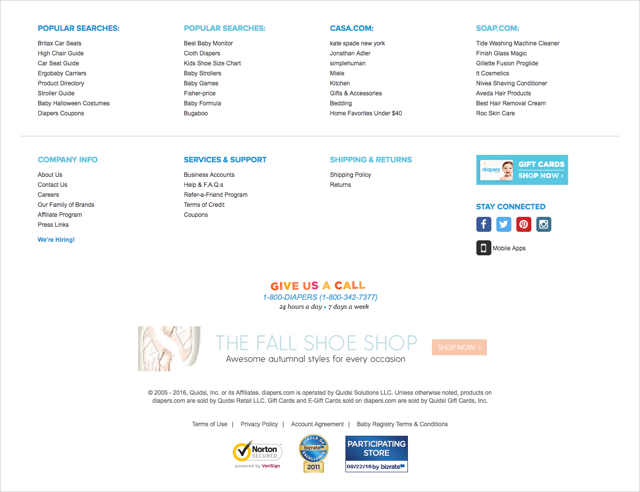
Diapers Footer Before

Diapers Header After

Diapers Footer After

Flyouts

Part of the project was redesigning all of the flyout menus to fit the new headers.

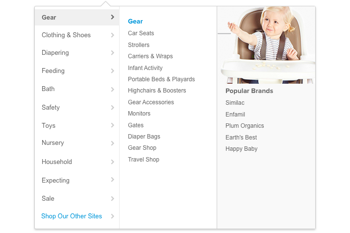
Category Flyout Menu

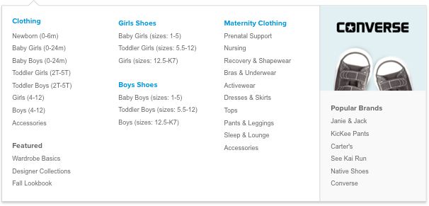
The new flyout menus are standardized across sites and easier to customize with full-column images and column background colors. 

Other Flyout Menus

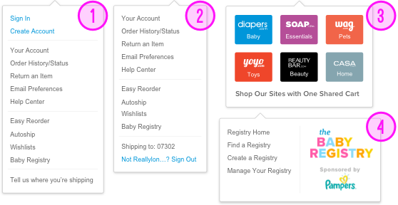
  1. My Account menu (not signed in)
  2. My Account menu (signed in)
  3. "Shop Our Sites" menu
  4. Baby Registry menu (only for Diapers)
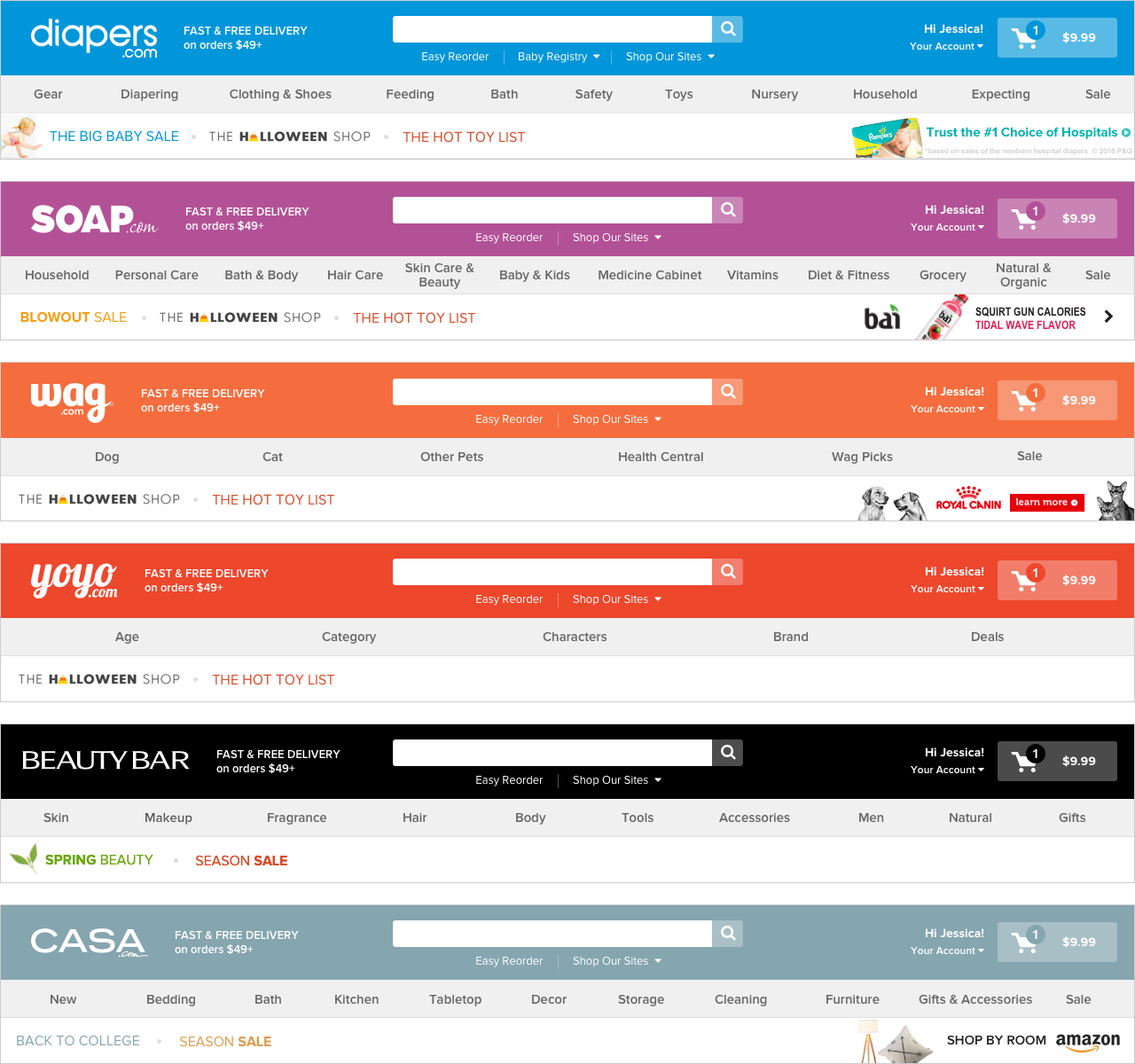
Variations

Site Variations

The final site chrome design is easily adapted to each of the 6 sites. Only a change in brand color and content (the categories and the internal and external ad zones) is necessary. 


Breakpoint Variations

To make sure that the site chrome was optimized for desktop screens of all sizes, I created variations for the top 3 breakpoints: 990px, 1280px, and 1500px.