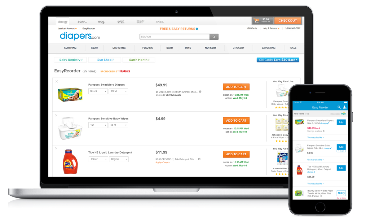
Platforms

Desktop
Mobile
iOS app

Roles

UX & UI Design
Prototyping
User Testing
Spec Writing

Tools

Sketch
Axure RP
Silverback


Objective

Easy Reorder allowed customers to quickly reorder items that they had purchased in the past, and our best customers were Easy Reorder users. We aimed to increase Easy Reorder usage and to improve the experience across all devices, with a special focus on mobile (iOS and mobile web).

The Easy Reorder project had two parts: the Easy Reorder page, described here, and the Easy Reorder homepage carousel.

Problem

Almost 70% of our top customers used Easy Reorder, but the feature hadn't been updated in years. In particular,

  • The Easy Reorder page was cluttered with little-used features, especially on desktop
  • No upsells or cross-sells existed in Easy Reorder, giving up a significant opportunity to increase average order size and advertising/vendor funding
  • The Easy Reorder page across all platforms looked outdated with older graphics

Solution

I redesigned the Easy Reorder page on all platforms, focusing specifically on:

  • Eliminating features with low usage and replacing them with features that users found more useful
  • Including product recommendations and the ability for vendors to sponsor products
  • Modernizing the Easy Reorder page for desktop and mobile

After drafting the new designs, I created the desktop prototypes and validated the new designs for both desktop and mobile through rounds of user testing.

Key Design Elements

Recommendations

Previously, Easy Reorder was only a list of the customer's past orders. Now, with recommendations and product sponsorships, the challenge was to separate them from the customer's actual products and to make them feel helpful rather than pushy.
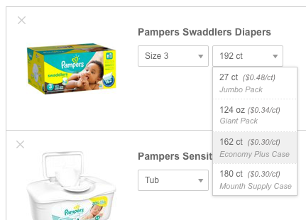
Attribute Dropdowns

Because children grow, a customer may want the same item she purchased before but in a different size. Therefore, it was important to make it easy for customers to choose the product variation they wanted with attribute dropdowns. 

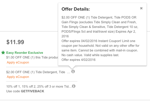
Promo Codes & eCoupons

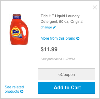
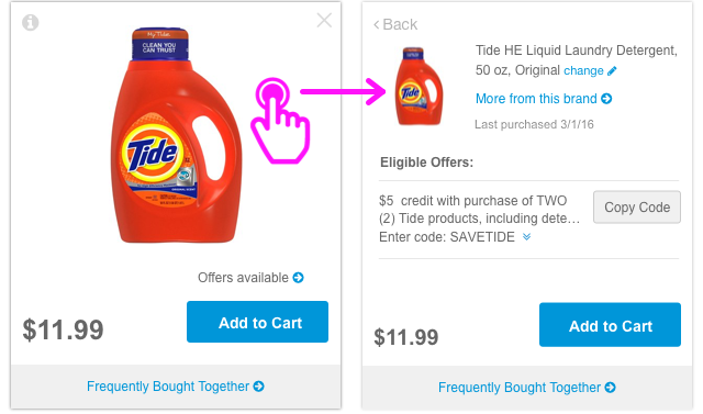
The buying team wanted to add an "Easy Reorder Exclusive" discount to promote use of the Easy Reorder page and get more vendor funding. This came in the form of an additional eCoupon that may be present if an item has vendor funding. In initially designs, all of the applicable discounts were displayed up front to give the user full information.
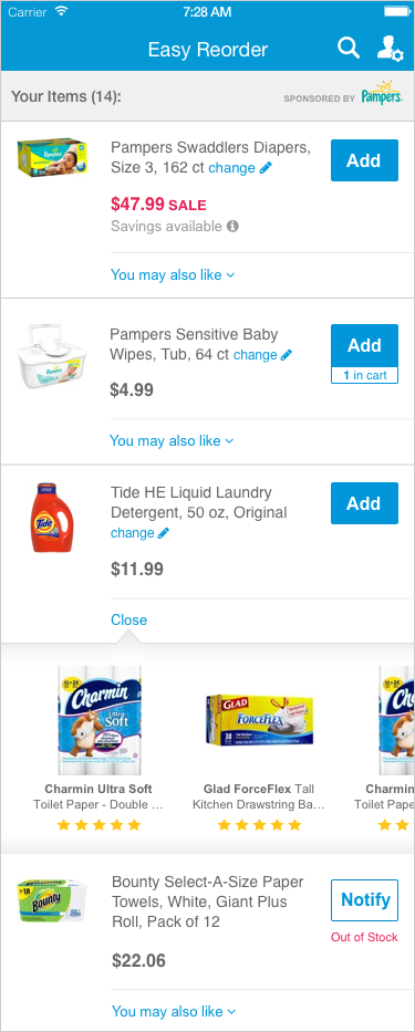

User Testing

After completing the first versions of the redesign, I led user testing for this project, taking charge of recruiting participants, drafting the test plan, moderating some of the sessions, and compiling a report. 

User testing details:
  • Features tested: Homepage redesign, Easy Reorder homepage carousel, and Easy Reorder page
  • 15 moderated sessions
  • 3 test versions: (a) desktop (7 testers); (b) mobile list view (4 testers); (c) mobile grid view (4 testers)
  • Setting: Quidsi user testing lab
  • Participants: Existing Diapers.com customers, primarily moms aged 30+ with small children. The participants were welcome to bring their children to the test sessions as well, in order to more realistically mirror the home setting where mom was likely to be shopping while keeping an eye on her kids.


Questions that I sought to answer:

Yes, all testers across desktop and mobile added Easy Reorder items to cart and understood how to delete items from the list without any problem. In response to the question "was it easy or difficult to shop the items on this [Easy Reorder] page?" 14 out of 15 testers said "Easy" or "Very Easy," while 1 tester on desktop responded with "Neutral." 

However, testers did encounter some issues with eCoupons and promo codes (see next question below).

Actions: None.

The testers had no problem finding and using the eCoupons and promo codes, but seeing multiple offers confused and inconvenienced them. 5 out of 15 testers stopped to read and compare all of the offer details because they thought they could only choose one offer to apply. As one tester commented, "Why not give just one coupon? And why not apply it automatically?"

Actions: Unfortunately, business requirements prevented us from being able to automatically apply eCoupons and promo codes. However, I adjusted the design to display only the eCoupon/promo code with the best savings instead of all applicable offers.

No, 5 out of 7 testers on desktop and 6 out of 8 testers on mobile noticed the Easy Reorder Exclusive discount, but the majority did not fully understand what it was.

Only 5 of the 15 testers correctly interpreted from the name and the discount details that (1) the Easy Reorder Exclusive discount was available because the user was shopping on the Easy Reorder page, (2) it wasn't available for all products, and (3) even if it was available for a given product at one time, it might not be available for the same product in the future. 6 testers expected it to be available every time for the same product, and 2 testers incorrectly associated it with recurring orders.

Action: After discussing the complexity of the Easy Reorder Exclusive discount and the usability issues it presented, the buying team agreed to remove the feature. They proposed other venues for getting vendor funding that we worked into the final design, like selling the first slot of the product recommendations.

Mobile testers did not experience any confusion, but desktop testers did.

4 out of the 7 desktop testers encountered difficulty with the recommendations on desktop. 2 of the testers expected to be taken to the product page after clicking on the recommended product. 3 testers also commented that the light orange overlay on the recommendations discouraged them from clicking: "...the shaded red recommendations look like they're out of stock and like something you're not supposed to touch."

Action: I removed the orange overlay and labeled the product recommendations for more clarity.

5 out of 8 mobile testers strongly preferred the list view, commenting that it was more familiar and it showed more products on the screen.

2 testers also encountered usability issues with the grid view. When they tapped on a product card, it flipped over to display the product information. However, they thought that the flip side of the card was a new page, and had trouble getting back to the product list. 

Action: I moved forward with the list view and further refined it for the final Easy Reorder design on mobile. 

Desktop

Version A

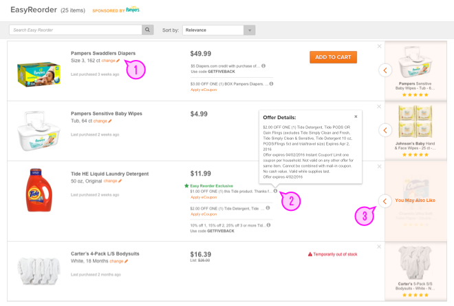
This first version of the desktop Easy Reorder page was user tested. Insights from testing:

  1. Testers did not like the additional step of clicking the "change" link to see attribute dropdowns
  2. Testers felt overwhelmed by multiple promo codes and eCoupons
  3. Testers did not recognize that the recommendations were clickable and did not expect a sliding drawer (below)
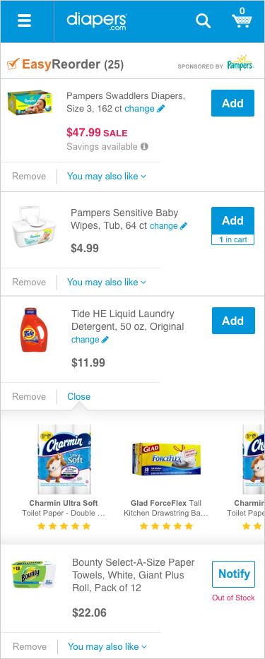
Version B (Final)

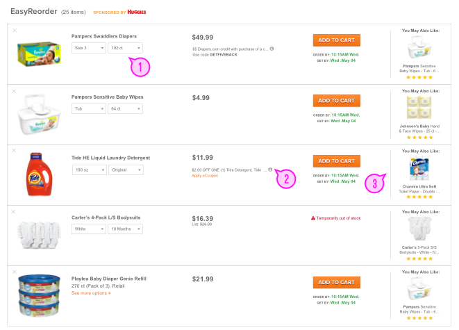
This second version addresses all of the issues of Version A:

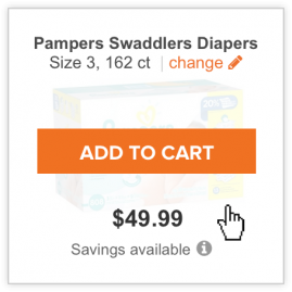
  1. Attribute dropdowns displayed by default
  2. Only one promo/eCoupon displayed
  3. Labeled recommendation that opens a recommendation modal (below)
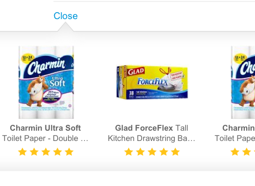
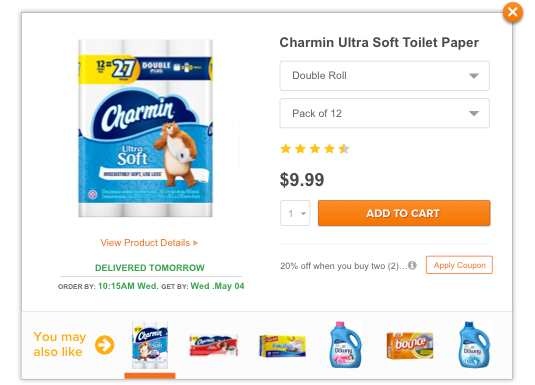
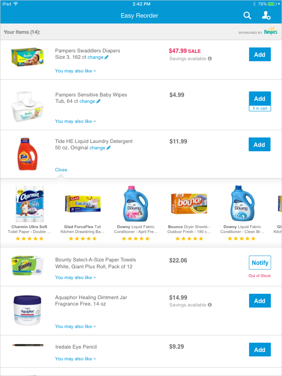
Recommendation Drawer

Recommendation Modal

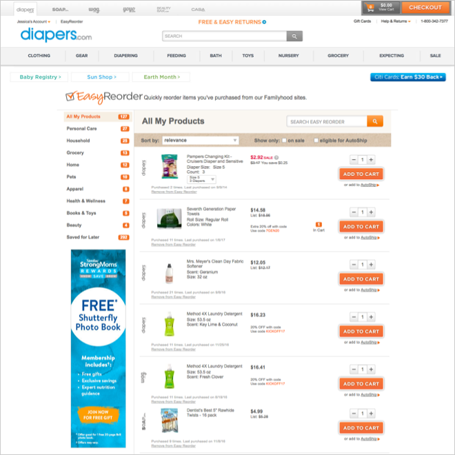
Desktop Easy Reorder Before

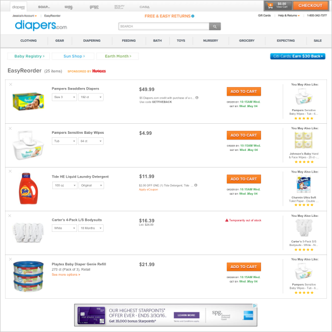
Desktop Easy Reorder After

Mobile

For mobile, I user tested two versions to see was more engaging and shoppable. Then, I adapted the winning version to the iOS apps, mobile web, and tablet web.

List View

This view is a more conventional list that shows more product information up front. Testers preferred this view because they found it to be a more familiar paradigm.

Grid View

This grid view features cards with big product images, following the trend towards imagery-based browsing. By default, the card displays minimal product information, as the user is likely familiar with products that she has purchased before. If the user wants more product details, she can tap the card for the full product information on the flipside.

During testing, users preferred the list view over this grid view. A few testers also encountered usability issues with the large cards.
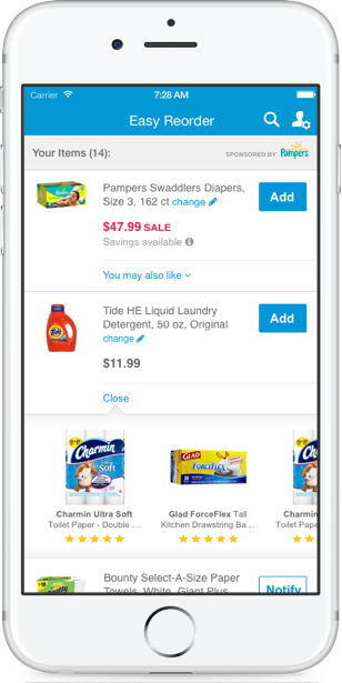
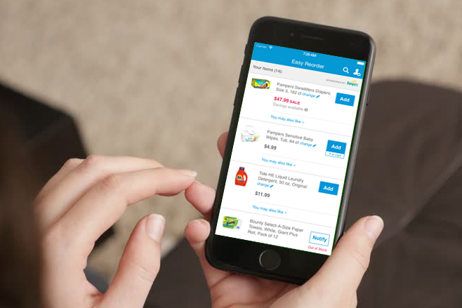
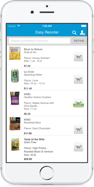
iPhone App 

The list view won from user testing, but there was still wasted space. Thus, I further condensed it to fit even more products above the fold.

Mobile Web

The mobile web view is almost the same as the app view, with only one difference: on the iOS app, the user can swipe left to remove an item, whereas on mobile web, there must be a "Remove" link.

iPad App/Tablet Web

Previously, the iPad app/tablet web view was simply a stretched version of the iPhone app/mobile web view, leaving a huge white space in the center. Now, the design has been rearranged to take advantage of the increased tablet real estate.

iOS App Easy Reorder Before

iOS App Easy Reorder After